

Read the following articles then answer the following questions.
What is the difference between defamation, slander and libel?
https://www.dropbox.com/sh/c17tbyv46nra9cb/AACAtWZUyCJKeAY8sN71ooK_a
You should produce a detailed evaluation covering fitness for purpose and appeal to target audience, referring to specific parts of your graphic design products.
You should make a number of references to client feedback.
You should compare your products with professional items.
You should explain and evaluate their choice of equipment and software.
You should describe how you responded to the client and suggest a range of improvements.
]]>

]]>
You must add some evaluation slides to your marketing presentation covering the feedback you received and describing potential changes to the product and changes to the marketing plan.
Feedback should be evaluated in terms of:
• changes to the advertising products and also your game if appropriate.
• changes to the marketing plan
Your evaluation slides should show potential improvements to the product and the marketing plan based on audience feedback.
The slides should make appropriate use of images, graphs and charts to convey meaning in an accessible and comprehensive format.
]]>
• a review of the market for this type of product
• a description of the target audience/consumer and the potential market
• the aims of an advertising campaign
• a draft/storyboard/script for two possible adverts
• a draft/storyboard/script for two possible promotions
• a schedule for the release of the adverts/promotions
• a description of how feedback on the campaign will be gained
• an explanation of the potential use of two official research bodies in gaining feedback
• an explanation of the role of the ASA and other official bodies in influencing the content of adverts.
]]>• took part in a meeting to choose the type of advertisement/promotion
• produced ideas/material for content
• edited material

Use this data to determine the likely number of clicks per view of your own banner ads. You will need to know how many times the ad is likely to be seen depending on the traffic generated by your chosen site.
]]>https://blog.twitter.com/2014/what-fuels-a-tweets-engagement
http://searchenginewatch.com/article/2318593/Retweets-Most-Likely-to-Happen-After-Hours-Study
http://www.usatoday.com/story/tech/gaming/2014/06/12/e3-five-trends/10358735/
http://royal.pingdom.com/2012/08/21/report-social-network-demographics-in-2012/


Use the above festival schedule and your own knowledge to plan out your marketing schedule and when it the best time to release the different parts of your marketing and the product itself.
Here's some other factors to consider
More best time to release your app
1) Explain what Google Glass is. (Be articulate, include images/videos/diagrams).
2) Read this article and describe what type of games Google think could be developed for Google Glass.
3) Lastly speculate and discuss 3 potential uses for Google Glass in the future of mobile/smart phone gaming.
]]>
]]>
MOTION CAPTURE
First use of Rotoscoping in Prince of Persia
Prince of Persia developer video
Digitised Video in Mortal Kombat
Motion Capture in Bioshock Infinite
PHYSICS
Battlefield 4 Physics
Article on Next Gen Physics Engines
ARTIFICIAL INTELLIGENCE
Believable character AI in Bioshock Infinite
Bioshock Infinite AI Developer Video
Buddy AI for Ellie in Last of Us
Storytelling in Bioshock Infinite
Whatever Happened to Videogame AI?
FACIAL RECOGNITION
Facial Capture software in LA Noire
From Facial Scans to Facial Animation
GAME CONTROLLERS
Project Morpheus v Oculus Rift
Industry article on Morpheus v Oculus
MMO GAMES
Extract from Minecraft history book
]]>
This is a case study taken from the blog of designer Jack Cass:
http://justcreative.com/2008/04/24/logo-design-process-of-just-creative-design/
It is very clear about the process and shows each of the stages that you should have for each of your Graphic Design products. From Brief to Sketches to Initial Feedback and Drafts, Colour and Typography. Use it as a model for your own design process
In this article I will talk about how I came to the name for my freelancing business ‘Just Creative Design’ and also the logo design process that I used to design the award winning logo that you see above.
This logo has won 3 major awards:
This logo also appears in these publications:
The process I used was somewhat disjointed and a very long one at that, mainly because I was designing for myself and I had no idea what ‘brand’ I was after, but this is it. Enjoy.
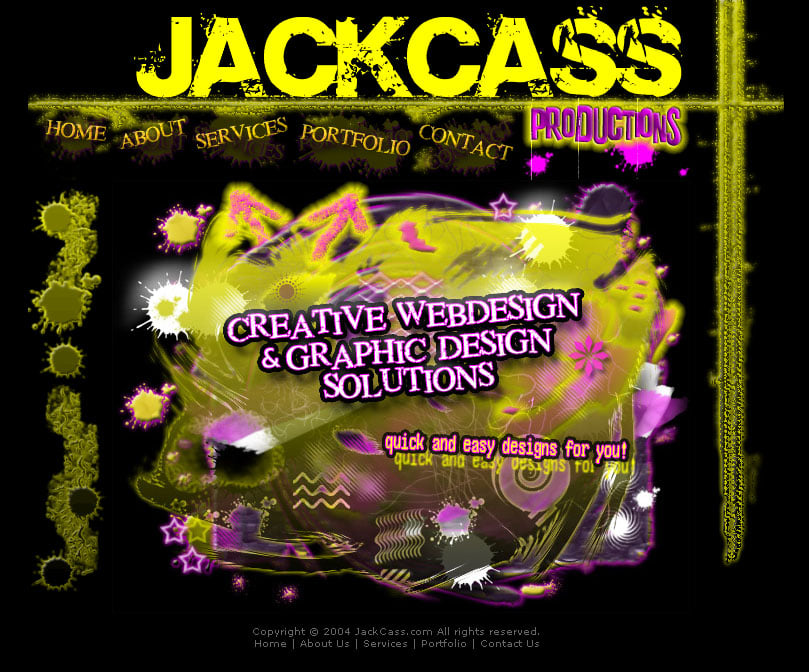
Believe it or not but this was one of the hardest parts of the process. Before I had JCD I was freelancing under the name of ‘JackCass Productions’ of which you can see above – this was when I was 15 (I’ve learned a lot since then). This was a clever pun of my name Jacob and Cass. I get called ‘Jack’ and ‘Jake’ quite a bit for my nickname instead of Jacob and when you combine the nickname Jack and my last name Cass… well, you get JackCass or jackass if you will.
I actually got very mixed feedback about this name ‘JackCass Productions’. About 50% of people loved it and 50% of people would say “why would you want to be called that”? There were pros and cons for both however in the end I chose not to continue using JackCass as the name and I think I made the right choice but in saying that I still have the domain jackcass.com just in case.
Ok, so now I had the problem of choosing whether to brand myself as my name ‘Jacob Cass’ or another name. Obviously I went with the latter however I still bought the domain name jacobcass.com. But now what to choose for my business name? I decided I wanted something unique, I wanted the word design in the title but I also wanted it to include my initials in the name if I could – ego, I know.
I had a million ideas, as you do… Jucy, Jaycii, JayZee, JayCee, Jaci, Jaysee, JayCee, JaySee, JaiSee, Juju, Juca, Joco, Jluc, Jaco, JC, JLBC and I won’t bore you with the hundred more that I had.

I couldn’t come down to a name I liked so I just played around with my initials to make a logo and you can see the sketches (to the left) of me trying to get J and C to work together. There were six A3 pages so I had to take a photo of it… it is 2mb if you want to look at it full size. Just a word of warning, I am no Picasso.
From these sketches I had the idea of trying to make the initials JCD into a pencil and after a bit of experimenting I got it to work.
Throughout the whole process I was up in air about the name of the business so I played with the names JackCass, Jacob Cass and Just Creative Design.
After getting the initial idea I experimented in Adobe Illustrator (the industry standard vector software) with different typefaces, sizes, proportions, etc. which you can see in the pictures below. I did this to see what typefaces worked and what line widths and combinations worked best together.

More play with the pencil idea…

I then finally came down to two styles, one which was the led pencil style and the one shown below.

At this time I received feedback from peers and from forums and many people told me that there was so many logos that incorporated the Fibonnaci Swirl.After a little research I found this was true and this meant that my logo would not be unique so I went with the led pencil idea. It was here that I tried to get the best size for the pencil to show off the JCD initials as well as making sure it looked like a pencil.
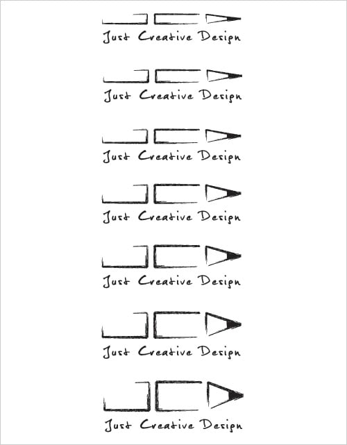
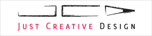
I ended up choosing the third size down from the top however something was not quite sitting with me and I narrowed it down to the typeface. I changed it to the typeface I used in the other example which was the font Delicious and knew that was the brand and look I was going for. It was a great logo that was scalable, memorable and worked in black & white.
More info: What makes a good logo?
After having an effective logo in black and white, it was time to add colour… I narrowed it down to the blue or the pink that I originally had in mind and then I chose out of these four colour combinations. I felt pink had more energy and was not so corporate and this was the decision I made. Pink, grey and white were my colours and my brand.

Above you can see the finished logo and I couldn’t be happier with the feedback I have received from everyone on this logo. At least once a week I get someone complimenting it which gives me a warm giddy feeling inside. Oh, and it incorporates my initials into it :)
]]>This is a case study taken from the blog of designer Nela Dunato:
http://neladunato.com/blog/case-study-wild-moon-spirit-logo-design-process/
It is very clear about the process and shows each of the stages that you should have for each of your Graphic Design products. From Brief to Sketches to Initial Feedback and Drafts, Colour and Typography. Use it as a model for your own design process
Published by Nela Dunato on March 27, 2014 at 19:45 in Creative process, Graphic design, Branding
When I asked people what they would like to know about logo design so I can write about it, most of them were confused about the process itself, and they didn't know if it's bad if they have no idea what they'd want their logo to look like.
In this post I share the entire logo design process for one of my clients, so you can get all the inside info about what goes into making a logo, from sketch to finish.
And we'll start with...
Wild Moon Spirit is a brand for integrative health coaching service. At the time when my client came to me for a logo design, she was still unsure about the name of her business, and she changed her mind a several times in the process, but that wasn't a problem at all, since the essence of her brand remained what we agreed upon in the beginning, and the name didn't affect the outcome much.
I sent my client a detailed questionnaire with about 20 questions that helped her to get clear on her desired brand qualities.
The answers to this questionnaire are the basis for all the work I do, and I keep coming back to it with every revision, so I can make sure I'm always within the guidelines the client has proposed.
My client included two illustrations into her brief, which had the qualities she wanted for her brand. One was a silhouette of a woman standing next to a wolf howling at the moon, and the other was a drawing of a woman's face laid over an organic coffee-painted background. When I saw the images, I knew we were a great fit, because this style is something I do very well.
This is what she wrote about the imagery:
What I like about these images is that both are a portrayal of the wild woman who lives inside each of us, our inner goddess and feminine power expressed.
[...] Anything with lotuses or the usual mind-body stuff is a little boring to me. I really want to portray the power of our inner feminine or wild woman.
When I hear someone saying that the industry standard is "a little boring", and they want something unique that speaks their core message, I'm thrilled to work on such a project.
I started by exploring the options on paper. I wrote out words that my client used in her brief and sketched some symbols that corresponded to these words.
Then I started combining these elements into symbols. The elements I used in almost all of them were a woman's form, the Moon and the wolf. In some of them the Moon wasn't explicit, but the circular shape hinted at it.
![]()
My desk with my initial sketches and a questionnaire the client filled out
When I was done on paper, I scanned these sketches and traced them on my computer, so I could send a cleaned up version to my client. I sent her 3 different logomark concepts, of which 2 had 2 different variations.
I explained that we're working on a monochrome version for now, and that the color will be added later when the symbol shape is finished.
![]()
First logo drafts sent to the client.
Excuse my terrible wolf drawings, concepts are not meant to be all perfect :)
The client was extremely satisfied with the direction I was taking, and she loved the wolf and woman incorporated into a circle. She especially loved the woman's hair turning into a wolf, so we were definitely keeping that aspect.
She preferred the women without a face, and made suggestions to incorporate the wolf and the crescent Moon into the last one.
I made the changes she suggested, and sent her another round of drafts:
![]()
The client decided that number 3 was her favorite so far, but she had a suggestion on how we could change the second one to make it better. She sent me an image of an art-nouveau styled female silhouette in profile that she liked a lot, and proposed that I change the woman in the second one into a profile. She also suggested to tilt the Moon in #3.
I thought those were some very good ideas, so I went on and created a new set of proposals.
![]()
Looking a bit better now, though the wolf is still not so great :)
The client decided that number 2 was definitely her favorite, and so we proceeded with that one.
I refined the wolf profile, and made two versions, light on dark, and dark on white. I preferred the dark on light, but I wanted to check in with the client.
![]()
The client agreed with me on the right one (yay!), and my next mission was to find the perfect colors combination and the font.
The client mentioned in her brief that her favorite colors were purples and blues (turquoises), but that she wasn't attached to the colors themselves. But later in our conversation as we discussed colors, she told me she wanted a gradient of some kind to imply the transformational process. I thought about that a bit, and while I could see the symbolism she was aiming at, in my experience logos with gradients had a rather techy look to them, and the trend of the gradients (so called "web 2.0" look) has passed and now those logos look dated.
I thought hard about this, and then I had an idea. What if this wasn't just a digital gradient, but something organic? I could tell she'd like it from the samples she'd sent me at first, but I didn't know it it was technically feasible to include a raster image into a vector logo. I had to ask my colleagues if it was possible, and I got a positive response and a tip how I can do that in InDesign.
I painted several sheets of paper in watercolor, using the client's favorite colors that I found quite suitable for the logo. I then scanned these, and superimposed the colored samples over the logo graphic. In the end I had some "swatches" the client could pick from:
![]()
The client chose the blue-turqoise combination, but she asked that the colors be more intense. I sent her the following samples, with my own comments.
![]()
A lot of times, a script font is not the best to use in a logo, but in the coaching industry aimed primarily at women, script fonts seem to be just as common as serif and sans-serif fonts (if you don't know what those words mean, the font you're reading right now is serif, and straight fonts without the little legs at the bottom are sans-serif, most famous of them being Arial and Helvetica).
I chose a font that went very well with the logomark, named Great Vibes.
I sent her some variations of blue text and gray text, alongside with dark-toward-light and light-toward-dark versions, plus a single-color version:
![]()
The client preferred the cyan text, and the version with the light woman turning to a dark blue wolf (on the left).
After the client has provided all the necessary feedback during several rounds, it's my job to prepare all the files for use. For every logo I create, I make multiple versions and file types, so compatibility with any medium is insured. These versions include:
All these versions come in both vector EPS format and transparent PNG. Vectors are required for professional use such as printing promo materials, and PNGs are compatible with every image editor, and clients can use them on their websites, social media and Word documents.
Now, before I prepared those final versions, there's something that bugged me about the font that I wanted to fix.
![]()
Those dots on O letters irked me (above), so I changed those letters manually (below)
All the letters were connected with lower joining strokes, but in the case of letters O and N the upper joining stroke seemed not only more logical, but prettier. Also, those dots? I don't dig them.
Most designers would probably just leave it at that, but I'm a perfectionist and I want to do things the best I can, even if the client doesn't notice the difference. It doesn't matter — it's not the client's job to examine fonts with a magnifying glass, but mine is.
After those details were ironed out, I created all the versions of the logo, and made a PDF sheet with the basic usage guidelines. I sent this package to my client who was eagerly awaiting to start using her brand new logo!
![]()
Final logo design for Wild Woman Spirit
Branding by Sam Soulek
C'motion is a program and product line that has brought gaming into the realm of physical education. Using dance games like Dance, Dance Revolution and a proprietary curriculum, C'motion is helping kids get in shape and have fun while they're doing it.
C'motion was an entrepreneurial pursuit and needed brand development from the ground up, including: Logo and Identity System, Product Graphics, Brand Standards Manual, Direct Mail, T-shirts, Buttons, Trade Show Graphics, Sell Sheets, and Product Catalog. The Product Catalog would double as a program introduction for teachers and schools. The catalog is offset printed on a toothy uncoated stock, using 2 spot colors + 4 color process for the photos, then perfect bound.
Most grade school kids are exposed to gaudy, overdone graphics wrought with gradients, drop shadows and purposeless 3D shapes. C'motion was seen as a step above their competition at national trade-shows and physical education conferences. The bright orange color and bold, modern graphics grabbed kids attention and got them excited about the program instantly.
Client: C'motion
Project: Brand Development
Agency: Catalyst Studios / Soulseven
CD: Jason Rysavy


]]>
http://www.photographymad.com/pages/view/10-top-photography-composition-rules
]]>
Take ten photographs of one subject to demonstrate:
Skills in composition: eg
• framing the image
• the thirds rule
• foreground/background balance
• perspective
• moving and static images
• photographic viewpoints
Skills in controlling image exposure, focus and using lenses chosen
from: eg
• shutter speeds vs aperture
• film types and film speed
• exposure determination and control
• manual and automatic exposure
• manual and automatic focus
• focal length and depth of field
• selecting and using different lens types
Skills in using lighting: eg
• direct light
• diffuse lighting
• reflected lighting
• high and low key lighting
• lighting sources
]]>]]>
CASTLE WOLFENSTEIN (1991)
As computers increased in power, it became possible to do limited real-time physical simulations. By 1997 the 3D "skeleton" of a character model could be built of multiple physical parts called rigid bodies that connected to each other just like the bones in a physical body, and were tied together by a system of constraints that restrict how they might move relative to each other. When the character dies, their body begins to collapse to the ground, much like a toy "ragdoll", hence the name.
HITMAN: CODENAME 47 (2000)
In 2007 the Euphoria physics engine was developed that combined 3D rigidbodies with realtime Artificial Intelligence. This enables the rendering of dynamic behaviours with characters responding spontaneously and realistically to changes in their environments:
MAX PAYNE 3 (2009)
http://uk.ign.com/articles/2006/05/10/e3-2006-indiana-jones-eyes-on
Research the Interactive Software Federation of Europe and produce a relatively concise post outlining:
The history
Purpose
Role of the organisation
]]>

Using all the research you have done (on your own product, market segmentation, games market) to inform the construction of three types of marketing
1 x DIRECT ADVERTISING