This is a case study taken from the blog of designer Jack Cass:
http://justcreative.com/2008/04/24/logo-design-process-of-just-creative-design/
It is very clear about the process and shows each of the stages that you should have for each of your Graphic Design products. From Brief to Sketches to Initial Feedback and Drafts, Colour and Typography. Use it as a model for your own design process
Case study: Just Creative logo design process
In this article I will talk about how I came to the name for my freelancing business ‘Just Creative Design’ and also the logo design process that I used to design the award winning logo that you see above.
This logo has won 3 major awards:
This logo also appears in these publications:
The process I used was somewhat disjointed and a very long one at that, mainly because I was designing for myself and I had no idea what ‘brand’ I was after, but this is it. Enjoy.
What will be my business name?
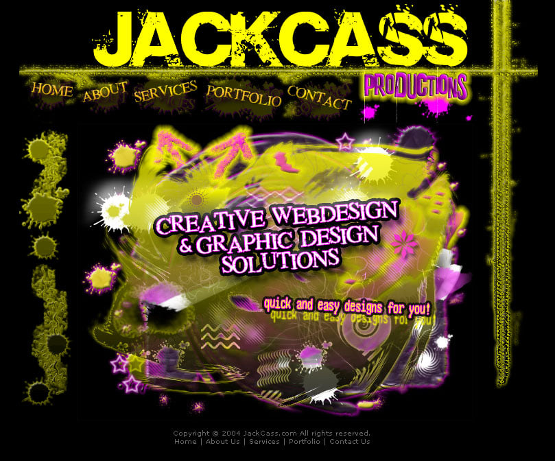
Believe it or not but this was one of the hardest parts of the process. Before I had JCD I was freelancing under the name of ‘JackCass Productions’ of which you can see above – this was when I was 15 (I’ve learned a lot since then). This was a clever pun of my name Jacob and Cass. I get called ‘Jack’ and ‘Jake’ quite a bit for my nickname instead of Jacob and when you combine the nickname Jack and my last name Cass… well, you get JackCass or jackass if you will.
I actually got very mixed feedback about this name ‘JackCass Productions’. About 50% of people loved it and 50% of people would say “why would you want to be called that”? There were pros and cons for both however in the end I chose not to continue using JackCass as the name and I think I made the right choice but in saying that I still have the domain jackcass.com just in case.
Ok, so now I had the problem of choosing whether to brand myself as my name ‘Jacob Cass’ or another name. Obviously I went with the latter however I still bought the domain name jacobcass.com. But now what to choose for my business name? I decided I wanted something unique, I wanted the word design in the title but I also wanted it to include my initials in the name if I could – ego, I know.
I had a million ideas, as you do… Jucy, Jaycii, JayZee, JayCee, Jaci, Jaysee, JayCee, JaySee, JaiSee, Juju, Juca, Joco, Jluc, Jaco, JC, JLBC and I won’t bore you with the hundred more that I had.
Sketches

I couldn’t come down to a name I liked so I just played around with my initials to make a logo and you can see the sketches (to the left) of me trying to get J and C to work together. There were six A3 pages so I had to take a photo of it… it is 2mb if you want to look at it full size. Just a word of warning, I am no Picasso.
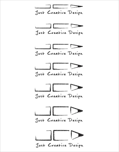
From these sketches I had the idea of trying to make the initials JCD into a pencil and after a bit of experimenting I got it to work.
Throughout the whole process I was up in air about the name of the business so I played with the names JackCass, Jacob Cass and Just Creative Design.
Illustrator
After getting the initial idea I experimented in Adobe Illustrator (the industry standard vector software) with different typefaces, sizes, proportions, etc. which you can see in the pictures below. I did this to see what typefaces worked and what line widths and combinations worked best together.

More play with the pencil idea…

The Final Two Concepts
I then finally came down to two styles, one which was the led pencil style and the one shown below.

At this time I received feedback from peers and from forums and many people told me that there was so many logos that incorporated the Fibonnaci Swirl.After a little research I found this was true and this meant that my logo would not be unique so I went with the led pencil idea. It was here that I tried to get the best size for the pencil to show off the JCD initials as well as making sure it looked like a pencil.
Font Change
I ended up choosing the third size down from the top however something was not quite sitting with me and I narrowed it down to the typeface. I changed it to the typeface I used in the other example which was the font Delicious and knew that was the brand and look I was going for. It was a great logo that was scalable, memorable and worked in black & white.
More info: What makes a good logo?
Colour
After having an effective logo in black and white, it was time to add colour… I narrowed it down to the blue or the pink that I originally had in mind and then I chose out of these four colour combinations. I felt pink had more energy and was not so corporate and this was the decision I made. Pink, grey and white were my colours and my brand.

Award Winning Final Logo
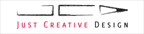
Above you can see the finished logo and I couldn’t be happier with the feedback I have received from everyone on this logo. At least once a week I get someone complimenting it which gives me a warm giddy feeling inside. Oh, and it incorporates my initials into it :)